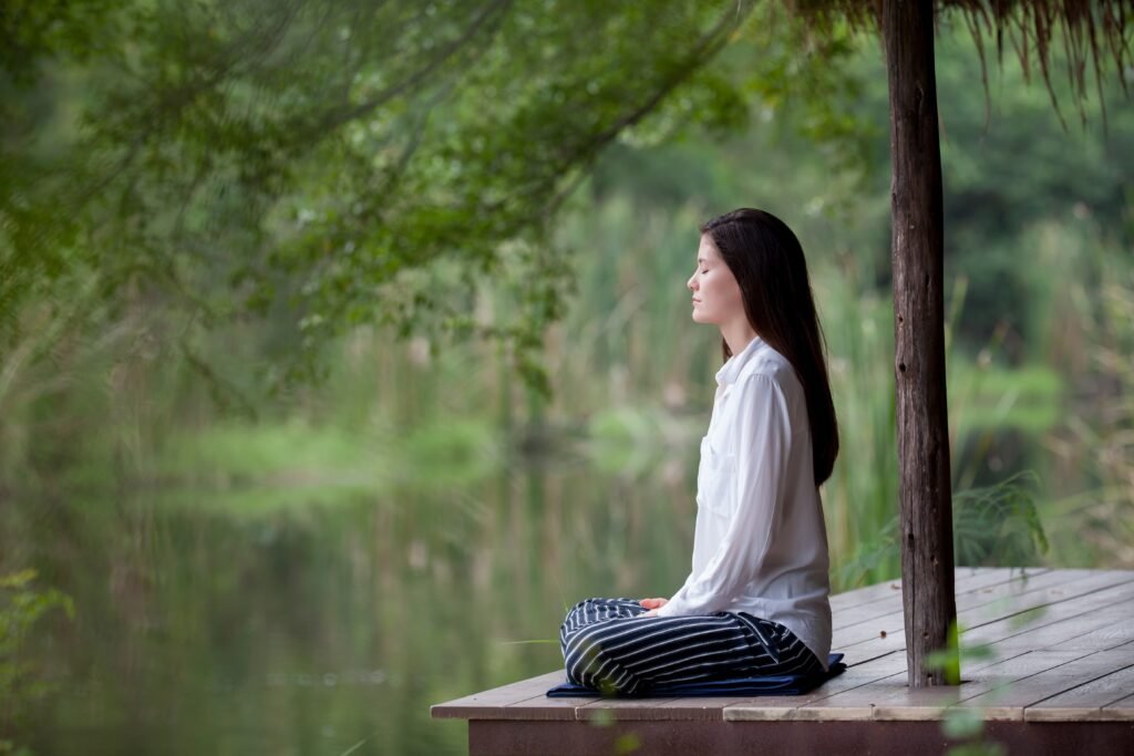
Airada is a Thai spa located in the heart of The Pearl Island, Doha — a quiet, refined sanctuary where people come to disconnect.
But their brand? Let’s just say it needed a little therapy of its own.
The Challenge
They called me in for a brand uplift — not a full rebrand. Which meant: ❌ I couldn’t change the logo. ❌ I couldn’t touch the original color palette. ✅ But I could still make it all make sense.
So I did what any strategist does when handed immovable assets: I moved everything else.
What I Did
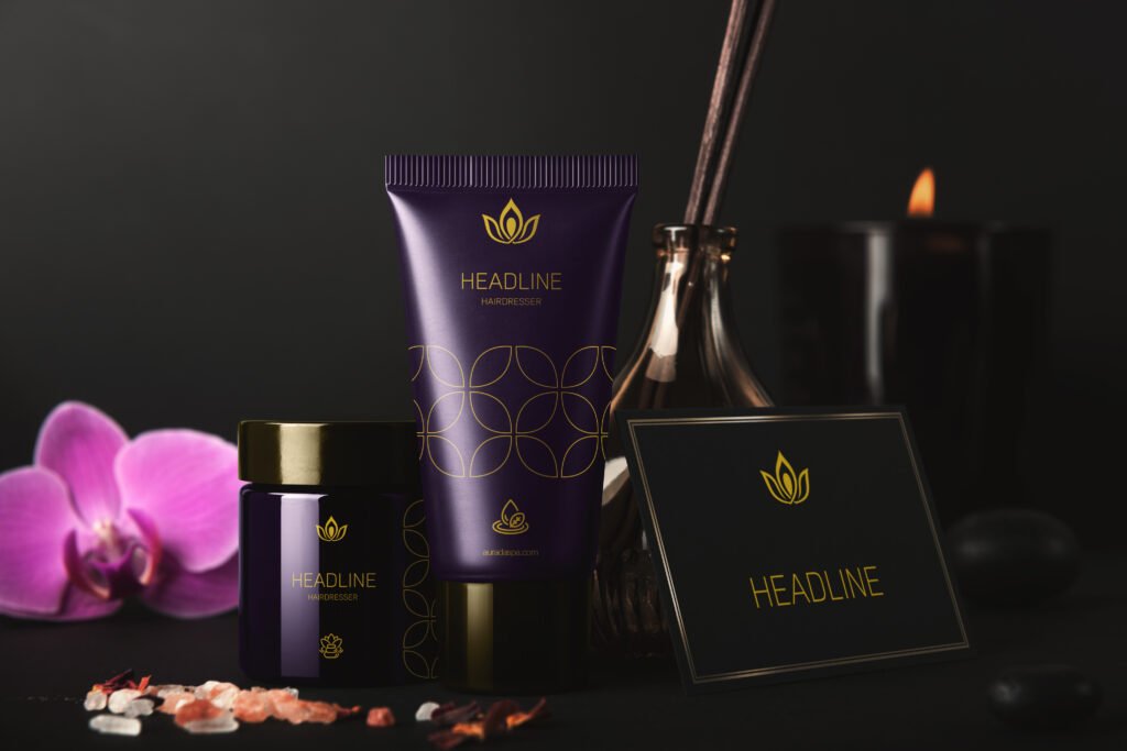
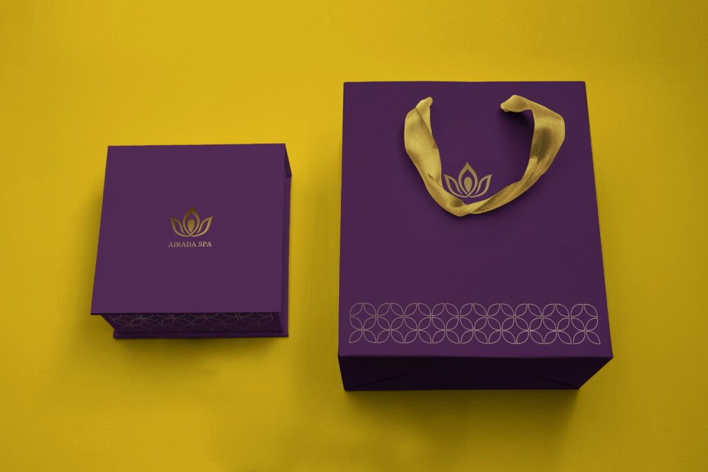
Refined the logo and icon without changing their essence — just enough to restore balance, elegance, and alignment
Built a new identity system that respected the original assets but raised the entire brand’s visual presence
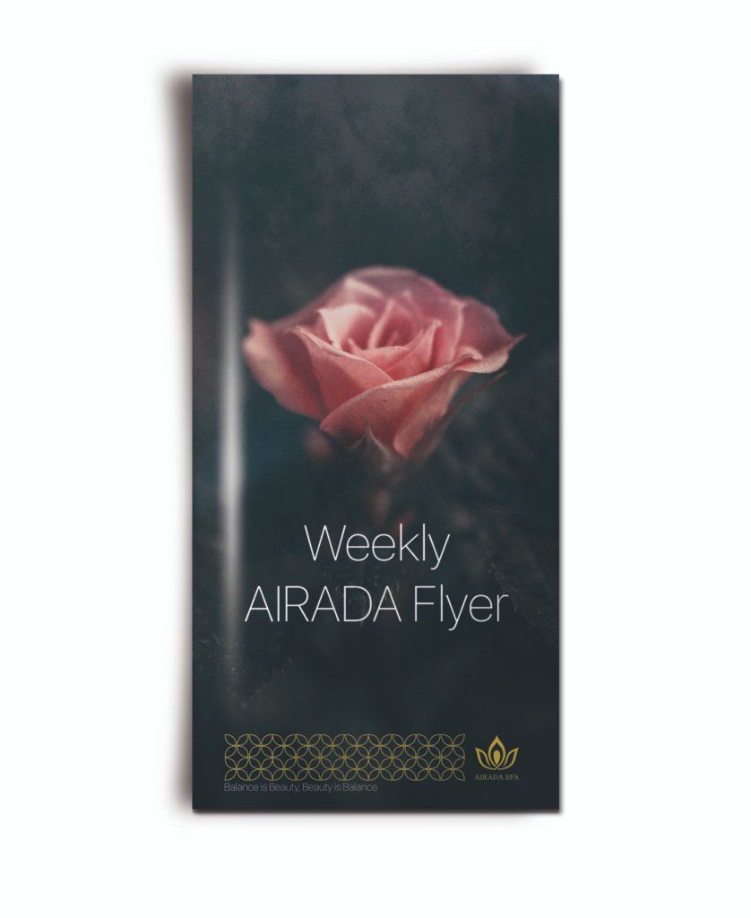
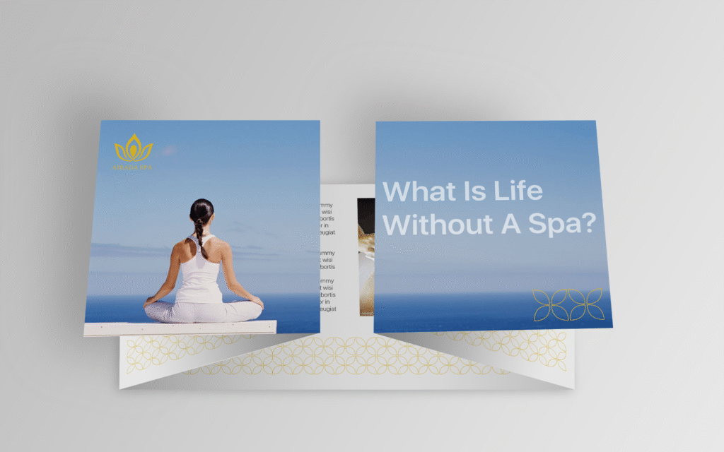
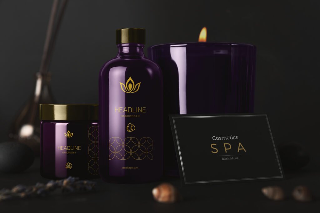
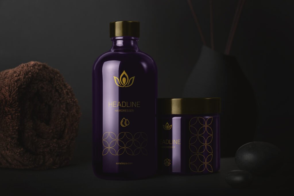
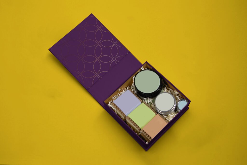
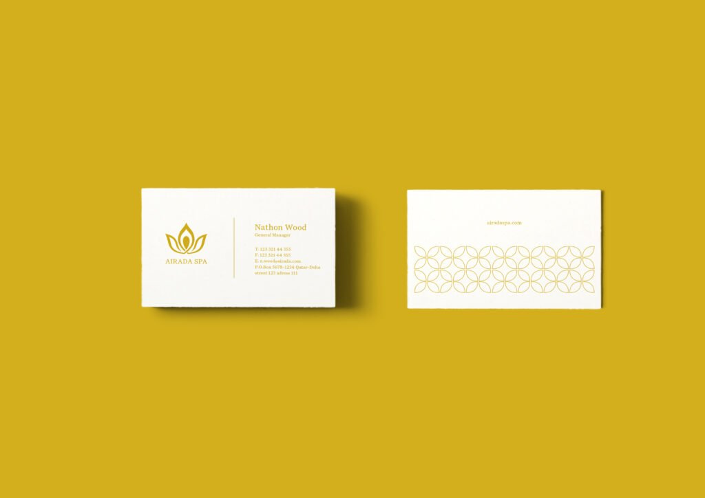
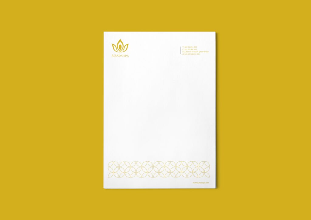
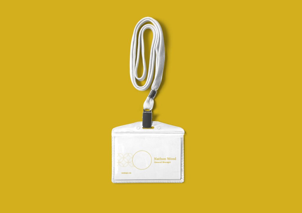
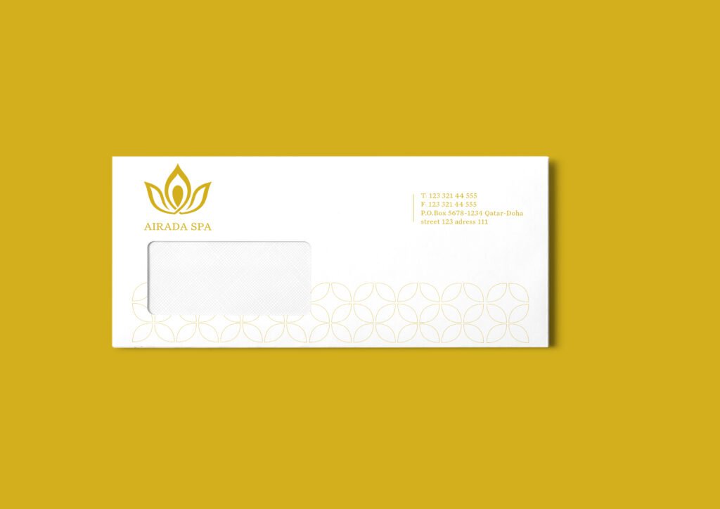
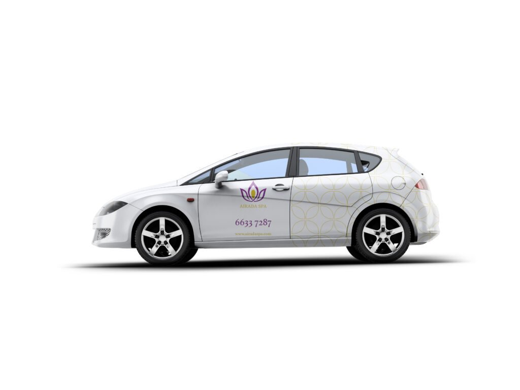
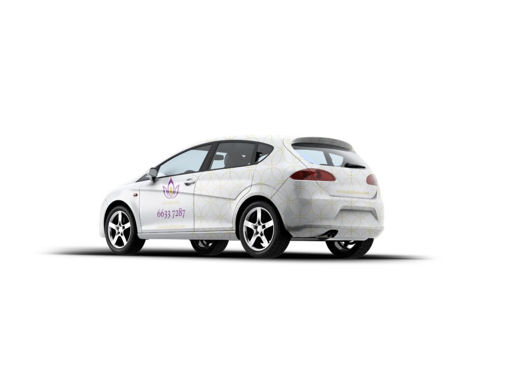
Led the creative team in designing a full brand suite: packaging, uniforms, signage, and print assets — all with clear consistency
Reframed the brand’s visual behavior to reflect its real value: calm, cleanliness, high-standard care
The Outcome
Airada now feels like what it always wanted to be: a premium, trustworthy Thai spa brand
The uplift added polish, structure, and harmony — without disrupting the core recognition
The team now has a consistent, flexible identity system they can actually use across touchpoints
Why This Project Mattered
Because not every brand needs to start over. Some just need someone to look closer — to clean the mirror, not smash it.
In the end, Airada didn’t become something else. It became more of what it already was.