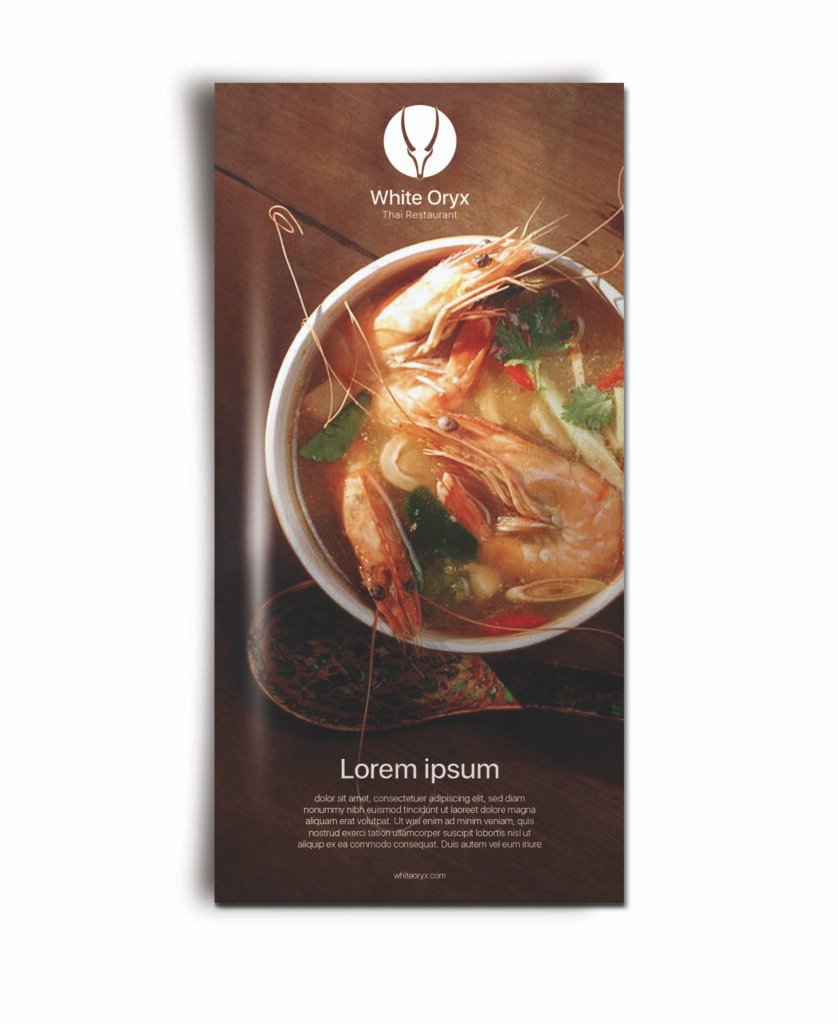
After successfully uplifting the brand identity for Airada Spa, I was called in again — this time for their sister company: White Oryx Thai Restaurant, located in The Pearl Island, Doha.
White Oryx is more than a restaurant. It’s a serene experience — offering authentic Thai cuisine with a philosophy rooted in well-being, balance, and harmony with nature.
The Challenge
Exactly like Airada:
❌ I couldn’t change the logo.
❌ I had to keep the original colors.
✅ But everything else? Fair game.
The Approach
Where Airada speaks in softness and stillness, White Oryx had to radiate warmth, nourishment, and quiet elegance — without looking like a typical health food place or losing its Thai authenticity.
So I:
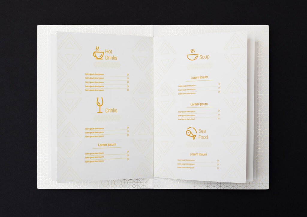
Refined their visual system while preserving logo integrity
Created a clean, nature-inspired identity behavior that reflects their values of health, harmony, and intentionality
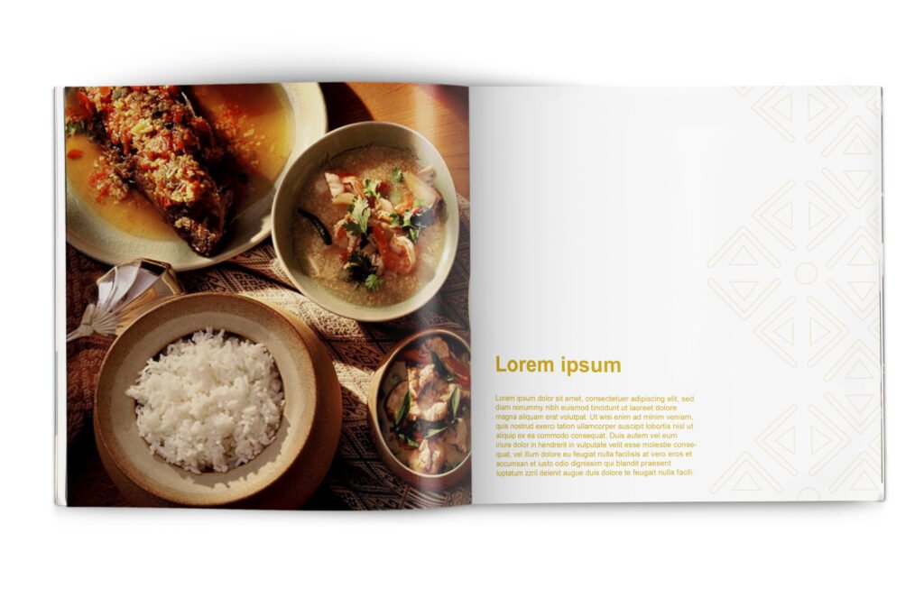
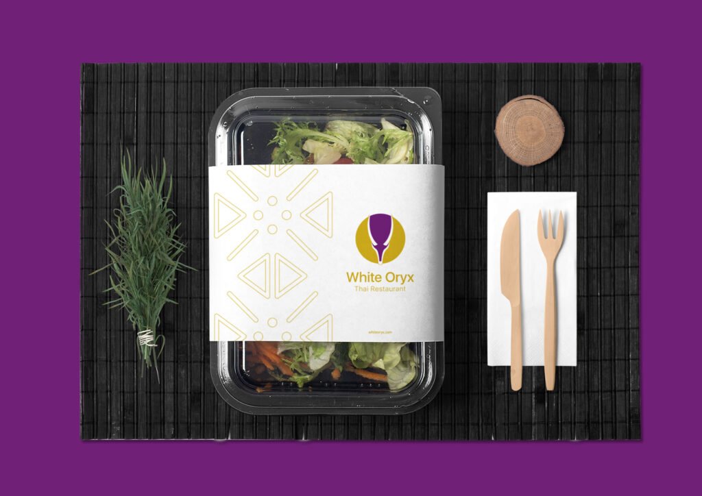
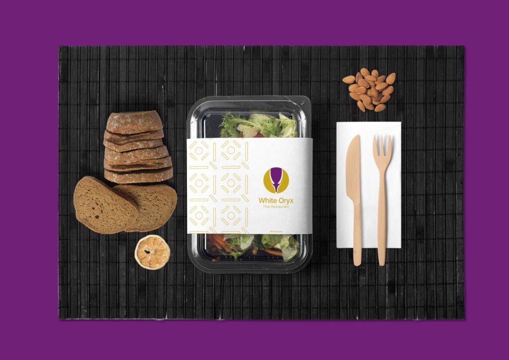
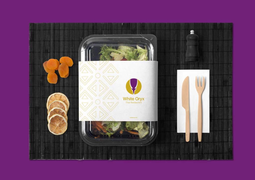
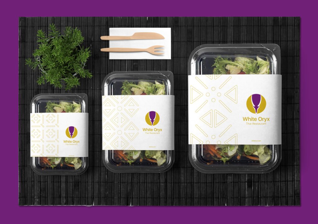
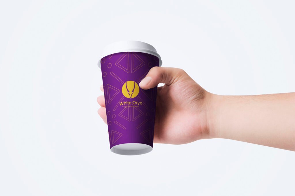
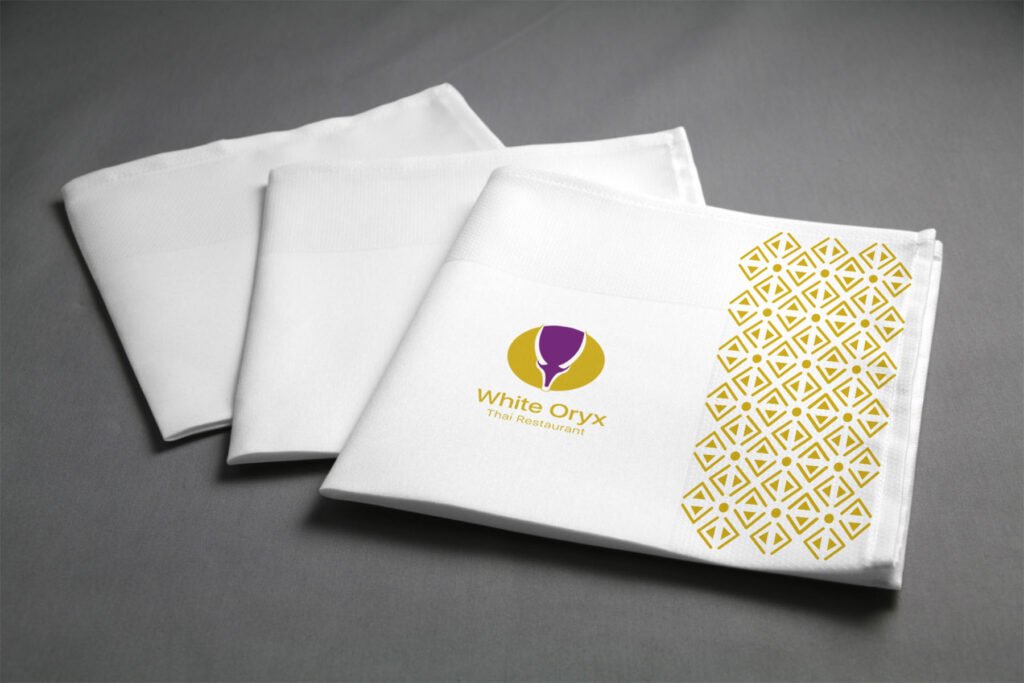
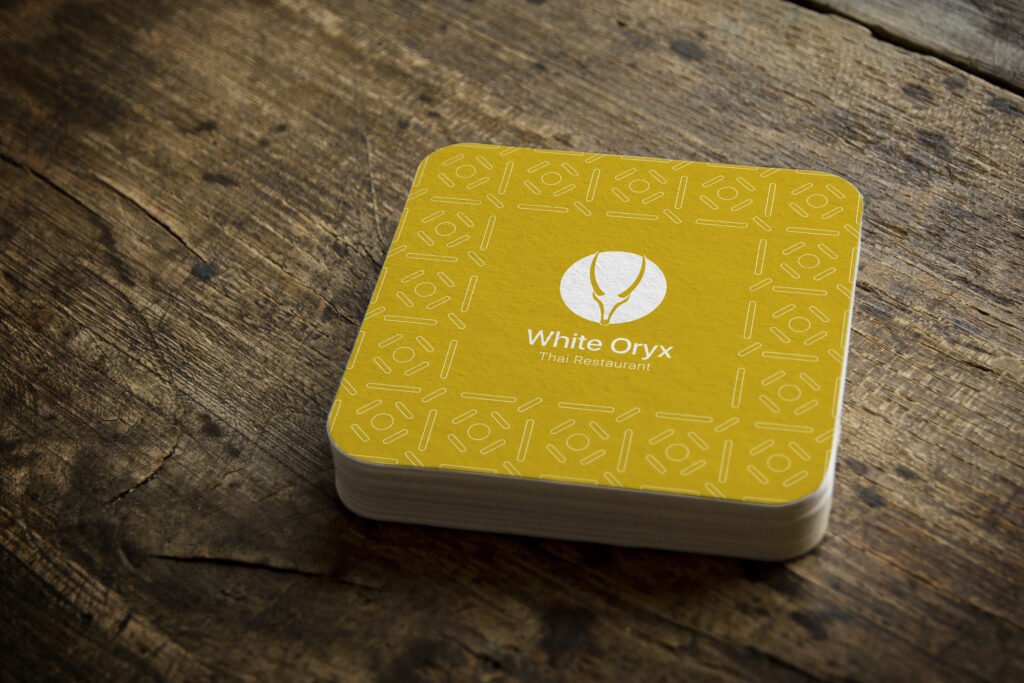
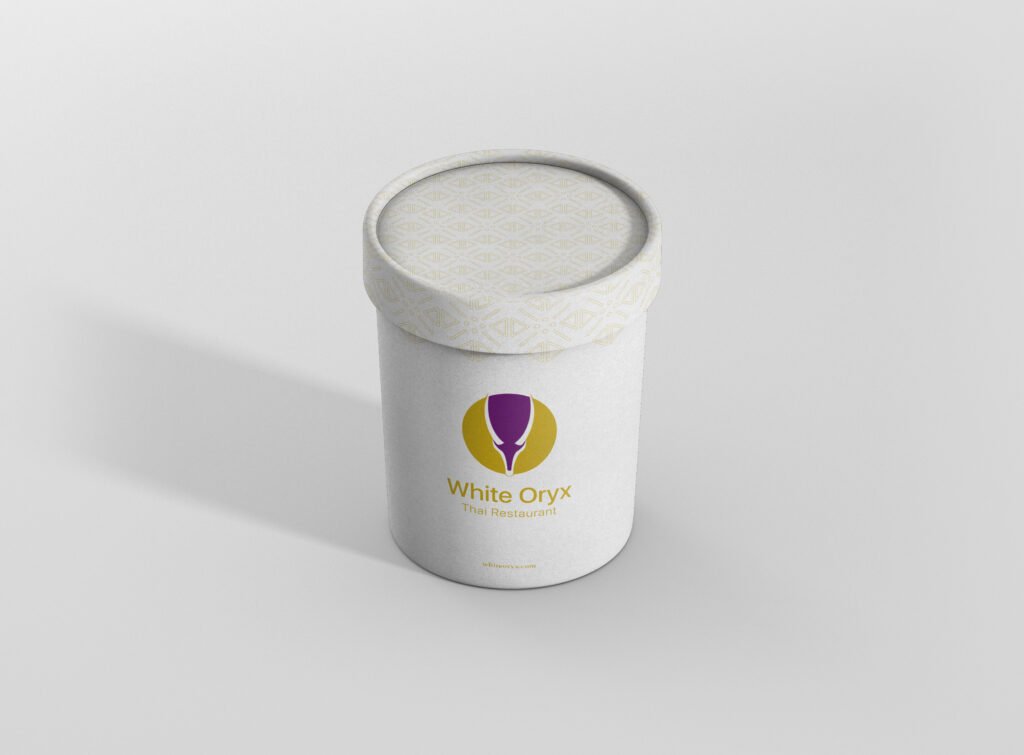
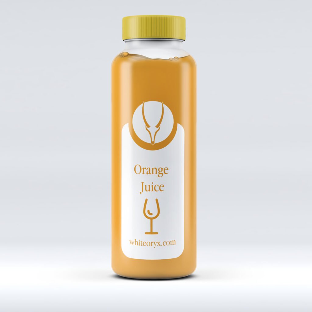
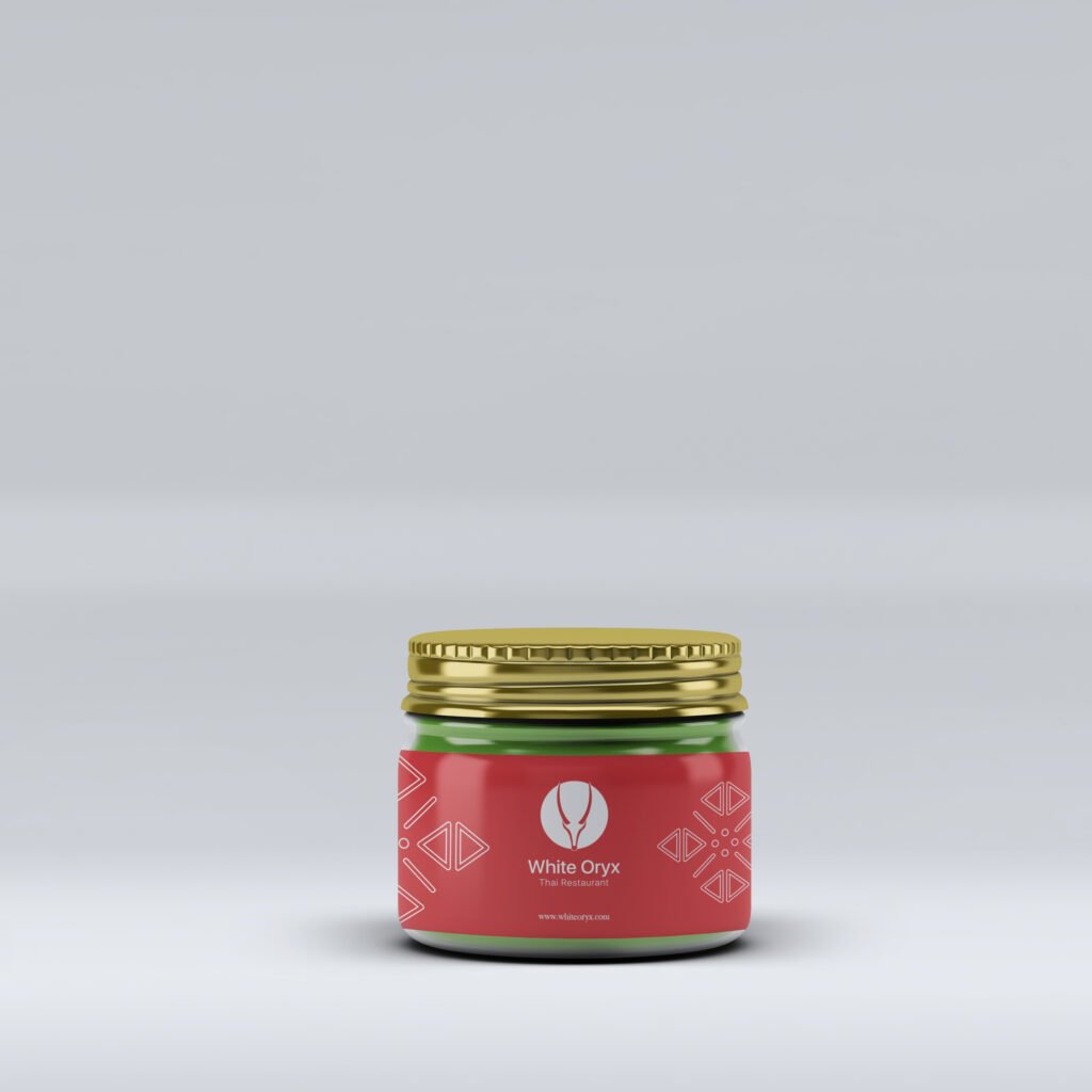
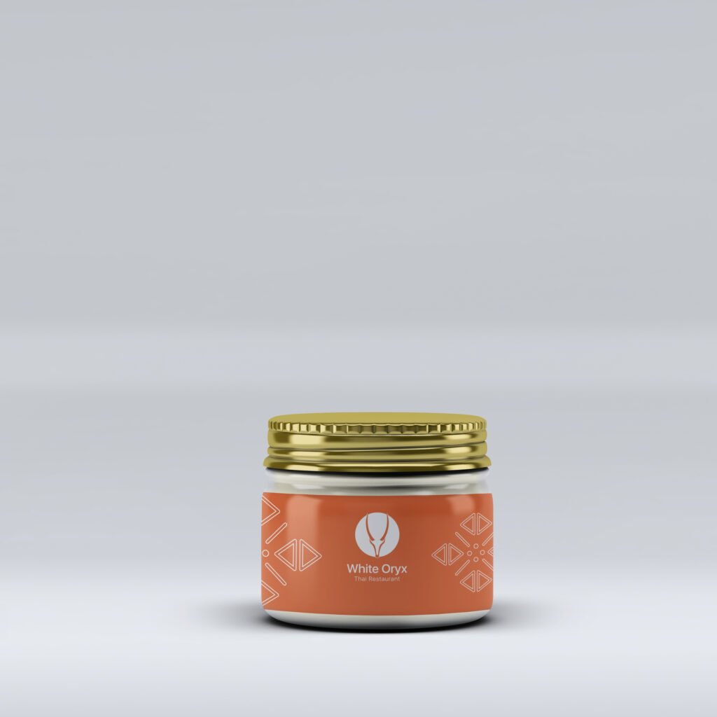
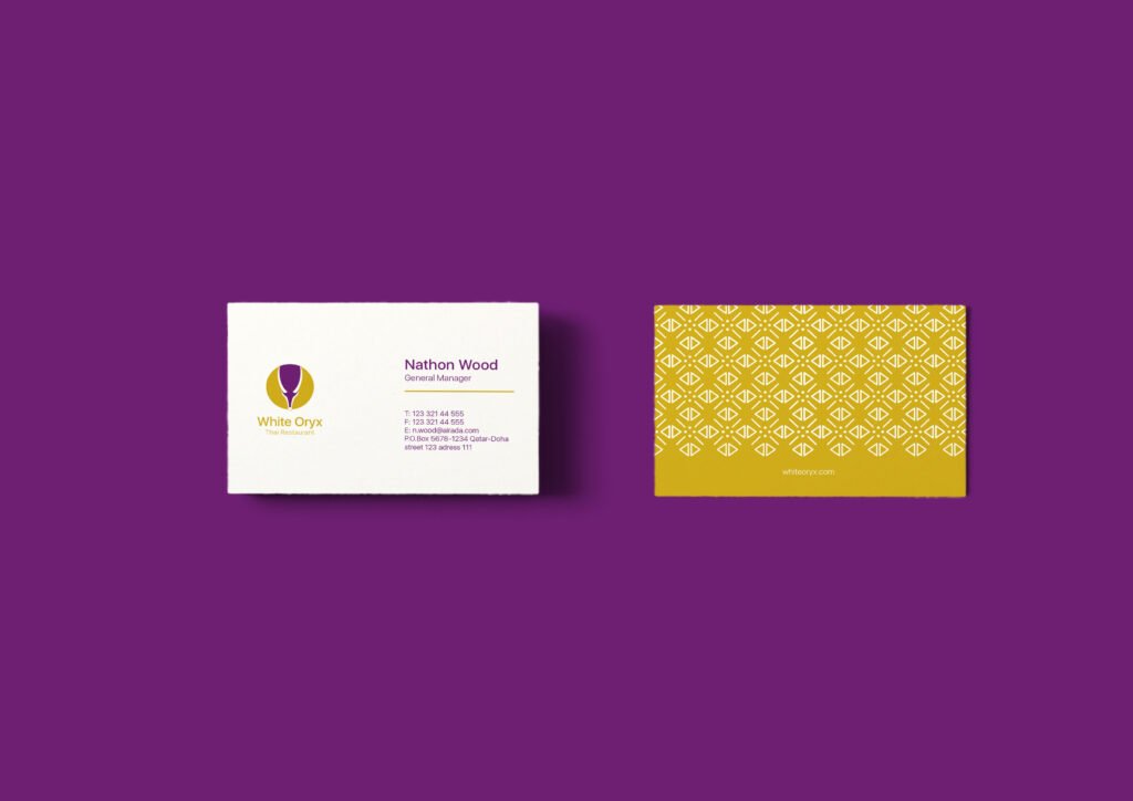
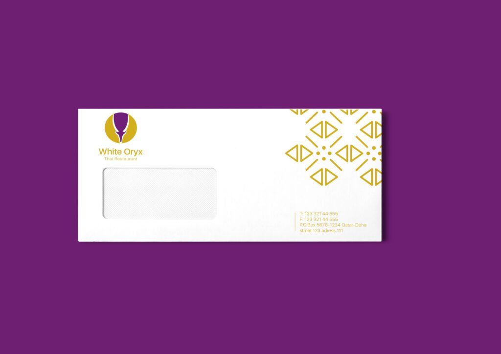
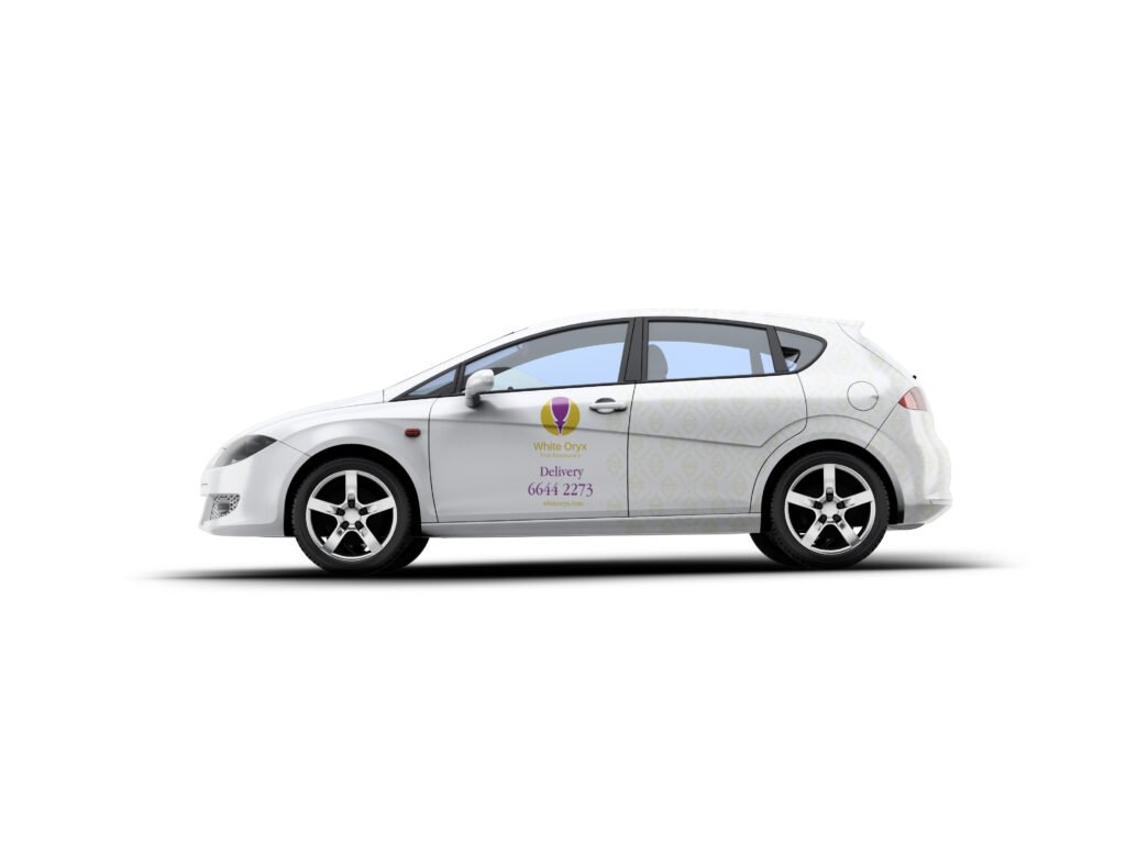
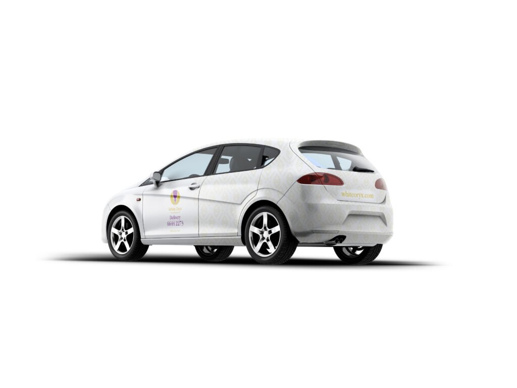
Established consistency across touchpoints: menus, packaging, uniforms, signage, in-restaurant experience
Guided their team on how to use the new identity with clarity and care
The Outcome
White Oryx now feels as premium as it tastes — without alienating its loyal clientele
The new brand system elevated their presentation and added coherence across the board
Like Airada, the uplift respected the existing equity — but brought in the strategy and elegance it was missing
Why This Project Mattered
Because healthy brands, like healthy bodies, don’t always need surgery. Sometimes, they just need better habits. In this case, we created a system that was aligned with nature, brand values, and business goals — and it worked.
Now both Airada and White Oryx sit side by side — looking aligned, feeling premium, and finally acting like they belong to the same vision.